
Ever wondered what role does color psychology play in decor? This article dives deep into how colors influence our moods, emotions, and even behaviors within a space. From the living room to the dining room, you’ll discover why choosing the right paint colors is more than just about what looks good. It’s about creating an environment that reflects your desired mood and energy levels.
We’ll explore how experienced interior designers leverage color theory as a powerful design tool to evoke specific moods—whether it’s using warm colors to make a room feel cozy or cool tones for a calming effect. Additionally, learn how to blend various shades with sunlight to enhance their vibrancy and effect.
By understanding these principles, you can breathe life into your home in ways you never imagined possible.
Disclosure: This blog contains affiliate links, which means that I may earn a commission if you click on these links and make a purchase. Rest assured, this does not result in any additional cost to you. My primary goal is to provide valuable content and recommendations that align with the topics and themes of this blog. I only promote products or services that I genuinely believe in and think can benefit you, my readers. Your trust is important to me, and I am committed to maintaining transparency and integrity in all affiliate relationships. Thank you for your support, and I hope you find the information and recommendations on this blog helpful.
Understanding Color Psychology in Interior Design
- Understanding Color Psychology in Interior Design
- Creating Harmonious Color Schemes
- The Influence of Specific Colors on Room Atmosphere
- Enhancing Natural Light Through Color Selections
- FAQs in Relation to What Role Does Color Psychology Play in Decor
- Conclusion
Understanding Color Psychology in Interior Design
If you’ve ever walked into a room and immediately felt calm or energized, it’s no accident. Color psychology, a potent tool in the realm of interior design, has the ability to summon distinct emotions through merely the shades that envelop us. For years, skilled decorators have adeptly utilized the study of color to craft environments that resonate with our innermost yearnings for solace, excitement, or repose.
The Science Behind Color Choices
So what’s the deal with color choices? It all starts with understanding how colors affect human behavior and mood. There’s a whole 12-part color wheel that designers rely on to pick out the perfect shades for your living room or dining room. This isn’t just about picking pretty colors; it’s about using design color psychology to make people feel right at home (or invigorated, depending on the goal).
For an in-depth exploration of how these theories manifest in actual environments, flipping through “Understanding the Psychology of Color in Spaces” comes highly suggested. Delving into this article, you’ll discover the art of selecting hues that transcend mere aesthetics—altering our very perception and mood within any given space.
Different colors play unique roles: warm colors like reds and oranges can increase energy levels and heart rate; cool tones such as blues and greens help reduce stress by creating calming effects. Then there are neutrals—think beige or soft gray—that offer versatility without overwhelming senses.
Creating Harmonious Color Schemes
Crafting harmonious interiors isn’t random—it requires skillful blending of complementary colors from opposite sides of the wheel or incorporating blue accents alongside neutral beige for an aqua-inspired oasis vibe. By choosing colors strategically—for example, including pink bathroom tiles because pink evokes carefree happiness—you set up every space to breathe life into desired moods before anyone even steps foot inside.
To master this art yourself—and believe me when I say it feels like wielding magic once you get it—I highly suggest giving Designing with Color a read through. It breaks down different schemes (like monochromatic vs split-complementary) so well; you’ll start seeing your home through an entirely new lens—one where every shade has purpose.
Feeling calm or energized by a room’s color isn’t an accident. It’s all about using color psychology wisely in interior design to evoke specific moods. By understanding the science behind colors and crafting harmonious schemes, designers can transform spaces into exactly what we need—be it a haven for relaxation or a boost of energy.
Creating Harmonious Color Schemes
When you’re aiming to create balance in your living space, the colors you choose can make or break the vibe. Imagine trying to incorporate pink into a room without it screaming ‘bubblegum explosion.’ Or think about blending blue into your decor so that it whispers tranquility instead of shouting ‘cold and uninviting.’ It’s all about finding that sweet spot.
Different color schemes like monochromatic, complementary, and split-complementary are more than just fancy terms—they’re your secret weapons for achieving a cohesive look. Monochromatic schemes use variations in lightness and saturation of a single color; this isn’t just one shade on every wall but rather an artful blend across furniture, accents, and walls creating depth and interest. Complementary schemes involve colors directly opposite each other on the color wheel, offering a dynamic contrast that pops without overwhelming. Then there’s split-complementary—a less intense version giving rooms vibrancy with added harmony.
Let’s talk versatility: incorporating blue doesn’t mean painting everything aqua blue from ceiling to floorboards (unless you’re channeling an underwater theme). Instead, using blue as an accent color against neutral beige walls can evoke calmness while keeping things chic. On the flip side, if you want warmth or energy levels up—think dining rooms where lively conversations happen over delicious meals—choosing warmer hues like oranges or deep reds might be right up your alley.
Picking out paint colors isn’t merely picking favorites off a swatch; it requires understanding how colors influence human behavior at their core level—the heart rate increase from seeing red or calming effect green has are not coincidences but responses ingrained within us all due to color psychology. Experienced interior designers leverage these reactions by choosing specific shades known for evoking desired moods; hence why baby blues tend towards children’s rooms while deeper hues often find their way into home offices designed for focus.
In essence? Creating harmonious color schemes means weaving together knowledge of design tools such as versatile color options along with psychological insights on how different tones affect mood—and doing so skillfully ensures spaces not only look aesthetically pleasing but feel exactly as intended too.
Mastering color schemes is key to setting the right vibe in your space. Use monochromatic, complementary, or split-complementary schemes for cohesion. Remember, it’s not just about picking colors but understanding their psychological impact to make rooms feel as good as they look.
The Influence of Specific Colors on Room Atmosphere
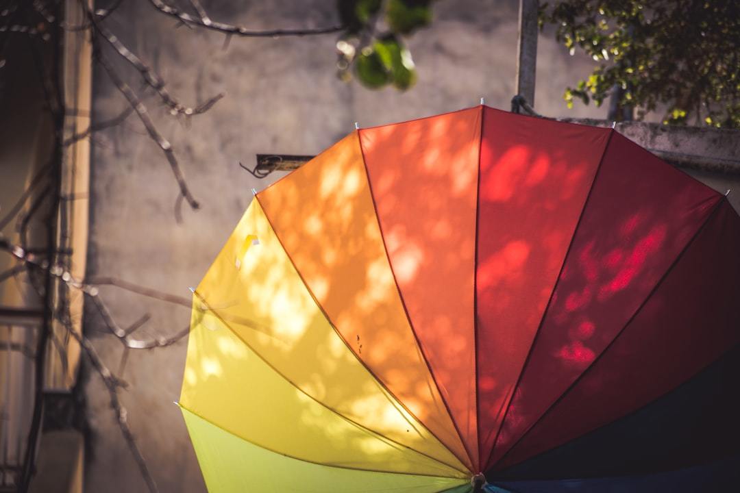
Ever wondered why some rooms make you feel calm and others ready to take on the world? It’s all in the colors. Yes, those hues splashed across your walls have a say in your mood swings. Let’s talk about how specific colors can totally shift the vibe of a room, making it anything from an energizing workspace to a zen den.
Evoke Feelings with Color Choices
Picking out paint colors isn’t just about what looks good; it’s also about how those colors make us feel. Orange, for instance, is not just fun at parties; it brings that sense of joy and excitement into any space. On the other hand, green doesn’t only remind us of nature but also stimulates feelings of balance and renewal within our homes.
Then there’s blue – everyone’s go-to color for tranquility. Whether it’s a sky-hued living room or an aqua blue accent piece in your dining room, this color has been shown to lower heart rate and create a soothing atmosphere.
Not forgetting purple which does more than jazz up children’s rooms—it sparks creativity wherever used. For real-world inspiration on incorporating these vibes through green tones specifically, check out why Vogue claims green is becoming as iconic as millennial pink.
Creating Inviting Spaces Through Hues
An inviting atmosphere goes beyond having comfy sofas or scented candles; sometimes, it’s all about choosing calming effects over vibrant explosions when selecting wall paints or decor pieces. Lighter shades tend to open up spaces while deeper hues add sophistication but may need ample natural light to avoid feeling cramped.
Aquamarine whispers relaxation into bedrooms whereas bold reds inject energy into dining areas—each hue setting up its unique ambiance.
Dabbling in color schemes can be intimidating, but Stoneside has your back with sage advice to mix and match without making your abode look like a chaotic burst of colors.
In essence, whether you’re looking to breathe life into dull spaces or dial down high-energy areas, tapping into the psychology behind each shade lets you craft spaces that don’t just look aesthetically pleasing but genuinely resonate with how you want people (including yourself) to feel inside them.
Color isn’t just for style; it’s a game-changer for room vibes. From orange’s joy to blue’s calm, picking the right shade can transform any space into your desired atmosphere.
Enhancing Natural Light Through Color Selections
Ever noticed how some rooms just seem to glow with natural light, making you feel instantly uplifted? Well, it’s not magic; it’s all about using colors smartly. Choosing the right paint colors can make a huge difference in how bright and airy your space feels. So, if you’re looking to give your home that sun-kissed look year-round, stick around.
The Science Behind Color Choices
You might be surprised to learn that there’s quite a bit of science involved when picking out paint colors for maximizing natural light. Experienced interior designers know this secret well: certain hues have the power to reflect light better than others, creating an illusion of more space and brightness. For instance, lighter colors and shades like soft whites or pastels will bounce sunlight around a room far more effectively than their darker counterparts.
To get even more specific about color selection, let’s talk about the color wheel—a powerful interior design tool mentioned earlier by Stoneside in their article on understanding the psychology of color in spaces. Interior designers rely on this 12-part wheel not just for aesthetics but also for its ability to influence mood through different combinations—like complementary or secondary colors—that can further enhance natural lighting effects.
Creating Harmonious Color Schemes
Mastering the art of equilibrium, selecting shades that amplify natural illumination becomes crucial. It’s all about mixing and matching without going overboard. A versatile approach involves incorporating pink into bedrooms for a soothing sunrise effect or blue tones in living areas for an open sky vibe—colors known for their calming properties which also help reduce heart rate.
Incorporating blue specifically has been shown to create feelings of tranquility—an essential factor if we’re aiming for rooms that are not only brighter but feel serene too. By choosing these kinds of strategic shades as accent pieces within larger palettes dominated by neutrals (think sandy beige or crisp white), we can breathe life into our homes while ensuring they remain aesthetically pleasing yet functional under varying degrees of sunlight throughout the day.
If balancing act sounds daunting—don’t worry. There are plenty of resources available designed specifically to guide homeowners through this process like “Designing with Color” by Stoneside which provides insights into combining different schemes effectively.
Choosing the right colors can transform your space into a bright, airy haven. Light hues like soft whites and pastels reflect sunlight well, making rooms feel more open. For a tranquil vibe, try adding calming blues or pinks as accents in neutral-dominated palettes.
FAQs in Relation to What Role Does Color Psychology Play in Decor
What is the psychology of color in decorating?
It’s all about how colors impact our mood and feelings. Picking the right shades can turn a room into a retreat or a vibrant space.
Why is color psychology important in design?
Because it shapes how we experience spaces. The right colors can make rooms feel cozy, spacious, or energetic.
What is the role of color psychology?
This science guides us to choose colors that boost mood, productivity, and comfort in our surroundings.
What is the color theory in interior design?
This theory helps designers blend hues to create appealing and effective spaces. It’s like mixing ingredients for the perfect recipe.
Conclusion
How significant is the impact of color psychology on interior design, really? It’s huge. We learned that colors do more than fill space—they shape our experiences.
From warm hues that cozy up living rooms to cool tones that calm down dining areas, the power of color is undeniable. Interior designers use this knowledge to craft spaces that not only look good but feel right.
Juggling various tints, we can manipulate sunlight’s play across spaces, altering our perceptions and emotions within these areas.
Incorporating blue can soothe us; splashes of orange might just spark creativity. Each choice matters.
Remember: every shade tells a story. Make yours worth telling by understanding the profound impact colors have on mood and atmosphere.